Visualizing Metrics
The AIBooster performance dashboard uses ClickHouse, a column-oriented database, for data storage and Grafana for visualization. By combining the powerful query capabilities provided by ClickHouse with the visualization panels from Grafana, you can analyze collected telemetry signals from various perspectives.
Overview of Standard Dashboards
AIBooster provides standard dashboards for visualizing various observed metrics. Select "Dashboards" from the left menu, and you will see the available dashboards.
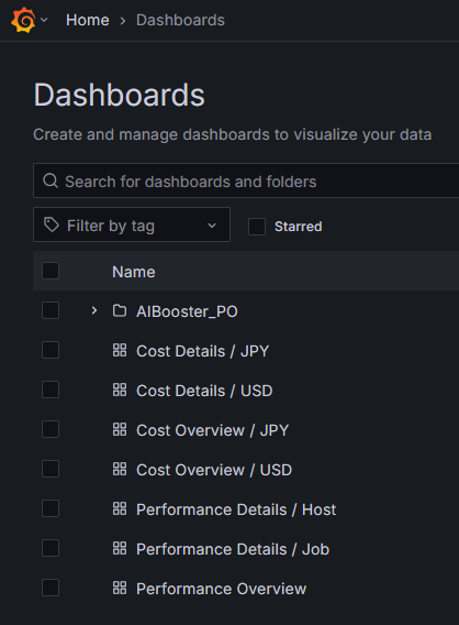
AIBooster dashboards are divided into performance perspective (those named Performance-) and cost perspective (those named Cost-). Performance perspective dashboards are intended for developers and researchers who want to improve the performance of AI workloads, while cost perspective dashboards are for those who want to track infrastructure costs and improve cost efficiency.
Additionally, dashboards named "Details" are designed to be accessed through links from Overview dashboards. Rather than opening Details dashboards directly, please start from Performance Overview or Cost Overview and navigate to each dashboard from there.
For more information about Overview dashboards, see Performance Overview Details and Cost Overview Details.
Changing the Observation Time Range
In the standard dashboards, you can change the observation time range from the dropdown list in the upper right.
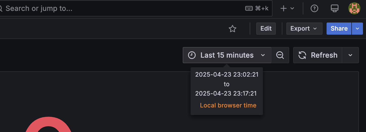
Here, you can specify the observation time range using either relative time (from now) or absolute time. For example:
- From 24 hours ago to now
- From 12:00 AM on 04/01 to 5:00 PM on 04/07
Additionally, you can select the observation range by dragging and dropping on a time series graph. This is an effective way to observe trends in other metrics after focusing on the change in a particular metric.