Visualizing Metrics
The AIBooster performance dashboard uses ClickHouse, a column-oriented database, for data storage and Grafana for visualization. By combining the powerful query capabilities provided by ClickHouse with the visualization panels from Grafana, you can analyze collected telemetry signals from various perspectives.
About the Standard Dashboard
AIBooster provides a standard dashboard for visualizing various observed metrics. From the left menu, select "Dashboards" and click "AIBooster Performance Dashboard".
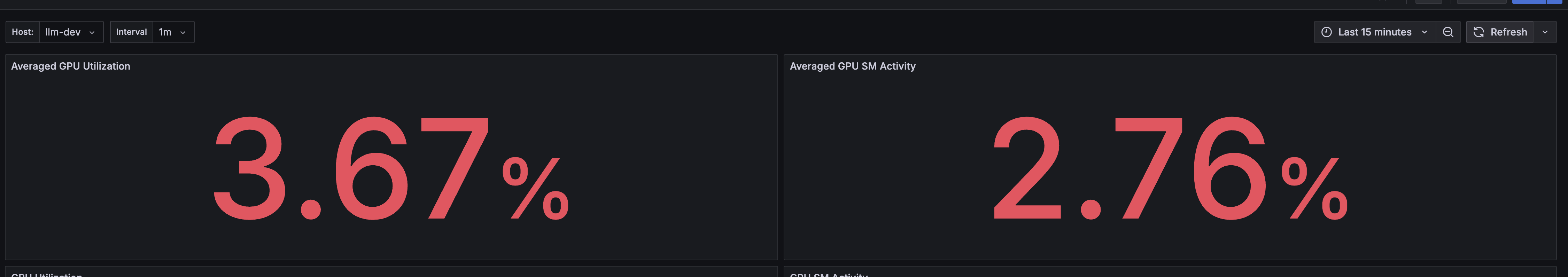
At the top of this dashboard, the overall workload's GPU Utilization (how much of the GPU is being used) and GPU SM Activity (how well the workload is optimized for the GPU) are scored on a scale of 0-100.
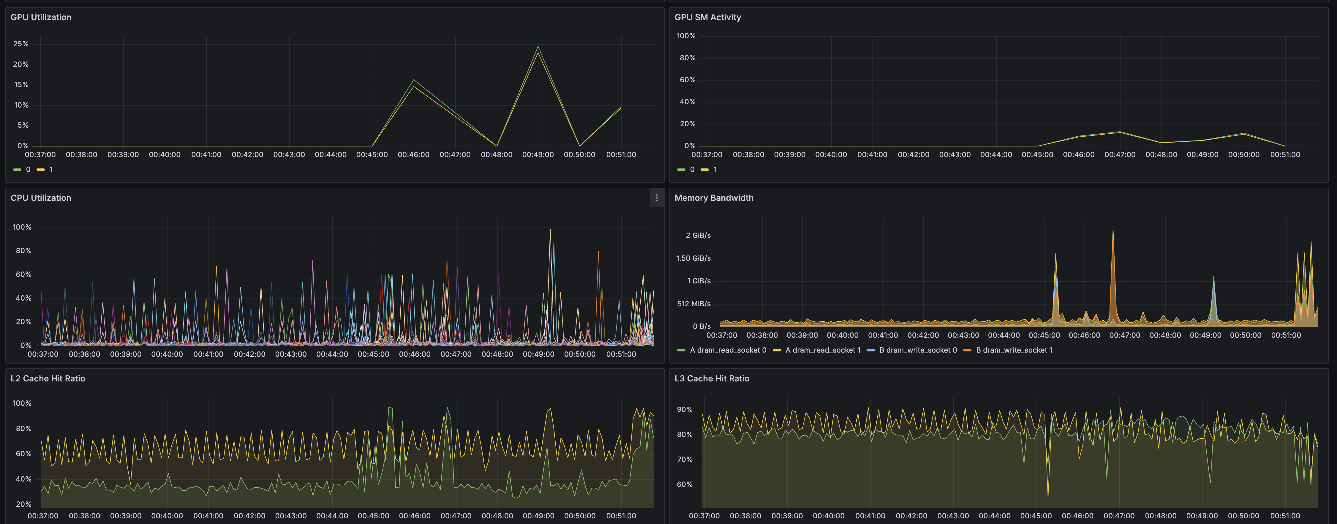
The following panels display the following metrics as time series graphs:
- GPU Utilization
- GPU SM Activity
- CPU Utilization
- Memory Bandwidth
- L2 Cache Hit Ratio
- L3 Cache Hit Ratio
- Network Bandwidth
- Storage Bandwidth
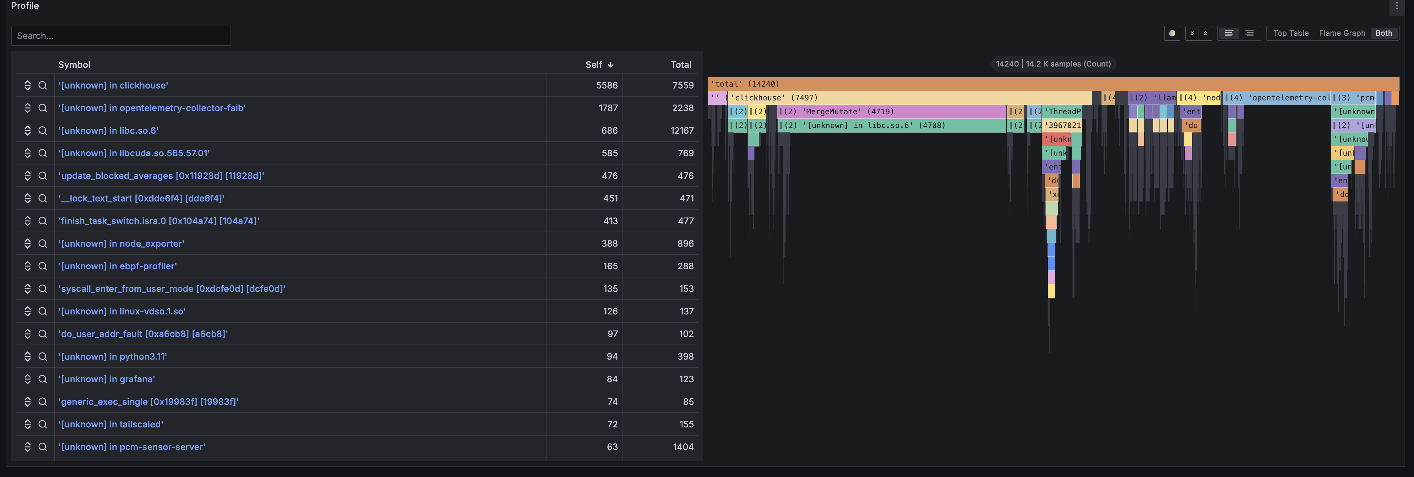
Additionally, the Profile panel allows you to view the flame graph of the program running on the node. The flame graph is a panel for analyzing program bottlenecks at the source code level by reconstructing sampled stack trace information. For details on flame graphs, please refer to pages like this one.
The following Prometheus exporters are supported, and they collect various metrics in addition to those listed here.
For details, please refer to the official documentation linked.
Changing the Observed Node
In the upper left of the dashboard, there is a dropdown list labeled Host:.
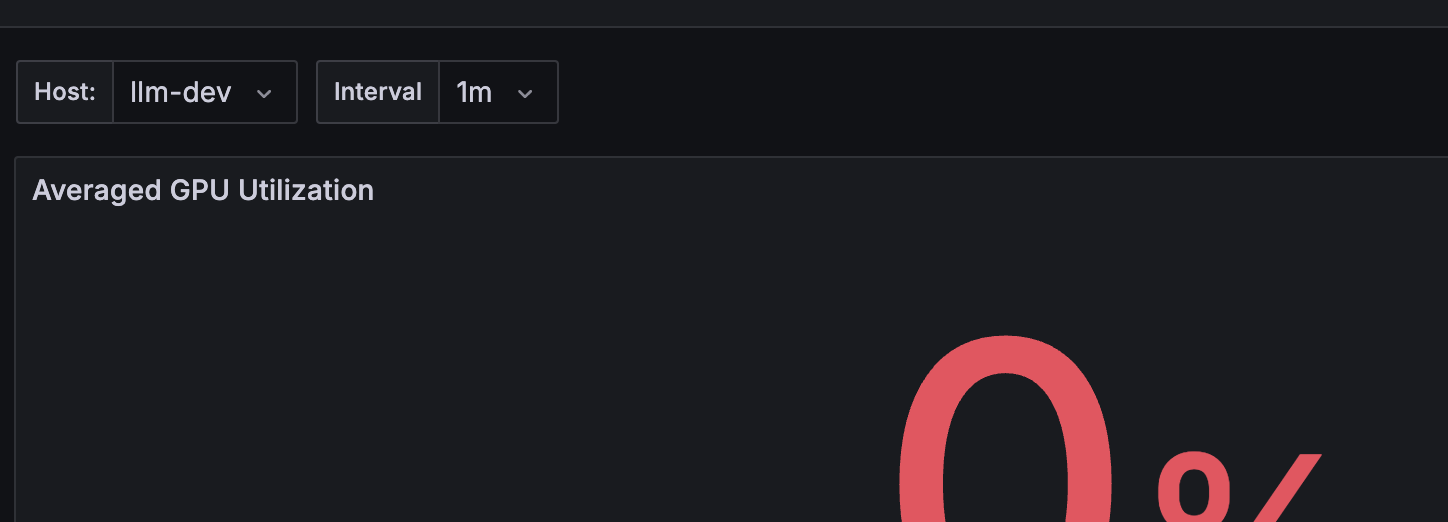
Here, the names of the nodes being observed by AIBooster are displayed as a list. By selecting an observed node from this list, you can switch the node being visualized.
Changing the Observation Time Range
You can change the observation time range from the dropdown list in the upper right of the dashboard.
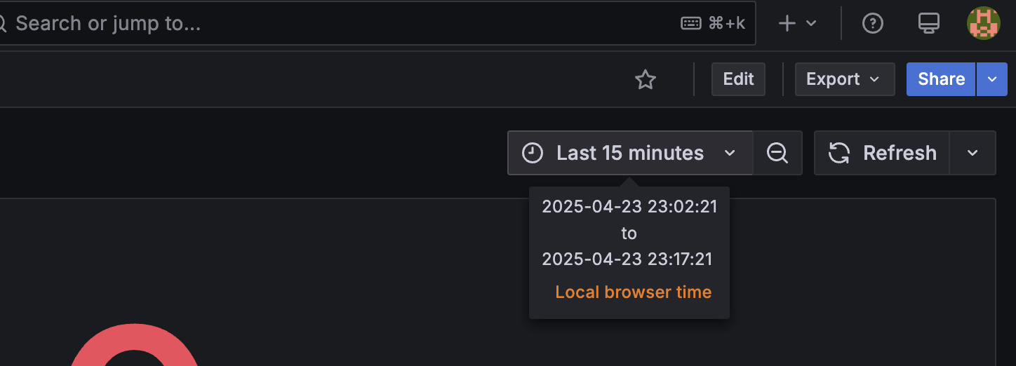
Here, you can specify the observation time range using relative time from the current time or absolute time. For example:
- From 24 hours ago to now
- From 12:00 AM on 04/01 to 5:00 PM on 04/07
Additionally, you can select the observation range by dragging and dropping on a time series graph visualization panel. This is an effective way to observe the trends of other metrics after focusing on the change in a particular metric.
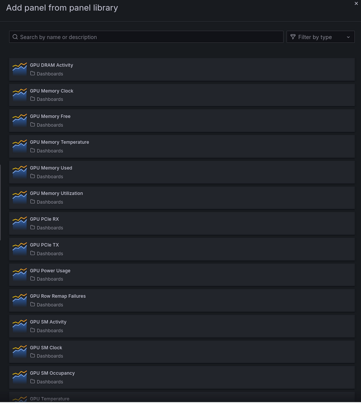
Adding Custom Panels Using Panel Library
Standard dashboards display only representative metrics, but you can easily add other detailed metrics using the Panel Library.
Steps to Add Panels from Panel Library
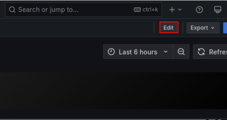
- Switch to "Edit" mode in any dashboard
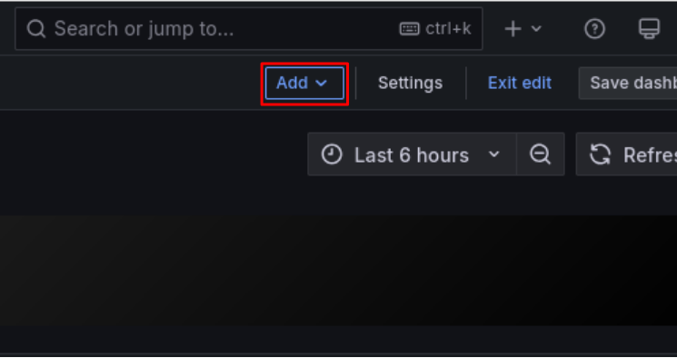
- Click "Add"
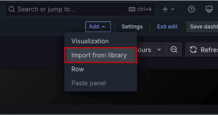
- Click "Import from library"
- Click the panel you want to use from the library panel list
- After adding the panel, click "Save dashboard" in the upper right if needed
Available Panel Library
AIBooster provides 101 panels organized into the following categories:
- GPU Metrics (DCGM): GPU utilization, temperature, power consumption, memory usage, profiling information, etc.
- System Metrics (Node Exporter): CPU load, memory, filesystem, network, ZFS-related metrics
- Process & Application Metrics: Go applications, process information, scraping statistics
For a complete list of metrics and detailed descriptions, see Metrics Details.